Reinventing the wheel

With a plan for international growth, Plandisc needed to improve the user interface of their online planning tool. We helped them achieve it.

Image
Image
Reimagined the look of the digital product to make it stand out
Optimised the screen layout to adapt to today’s larger monitors
Redesigned the navigation to improve the user experience
Overcome back-end complexities to improve the user experience for tablet and mobile users

CHALLENGES

The key challenges we faced on this project

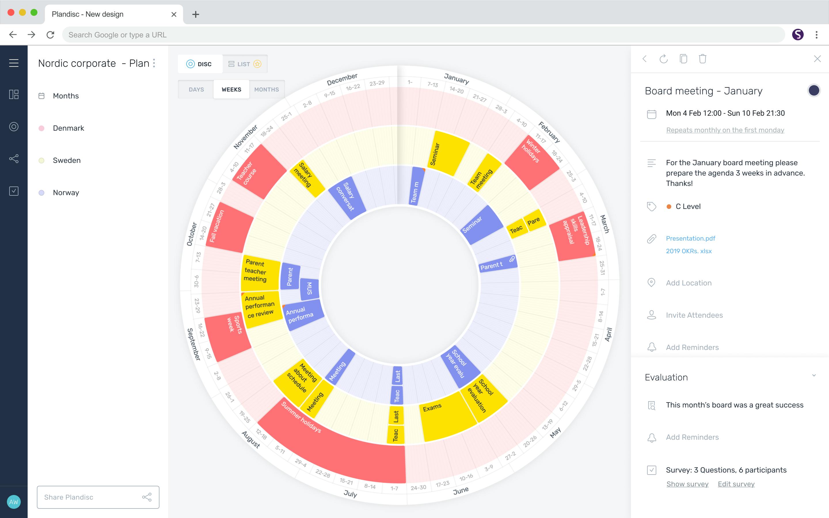
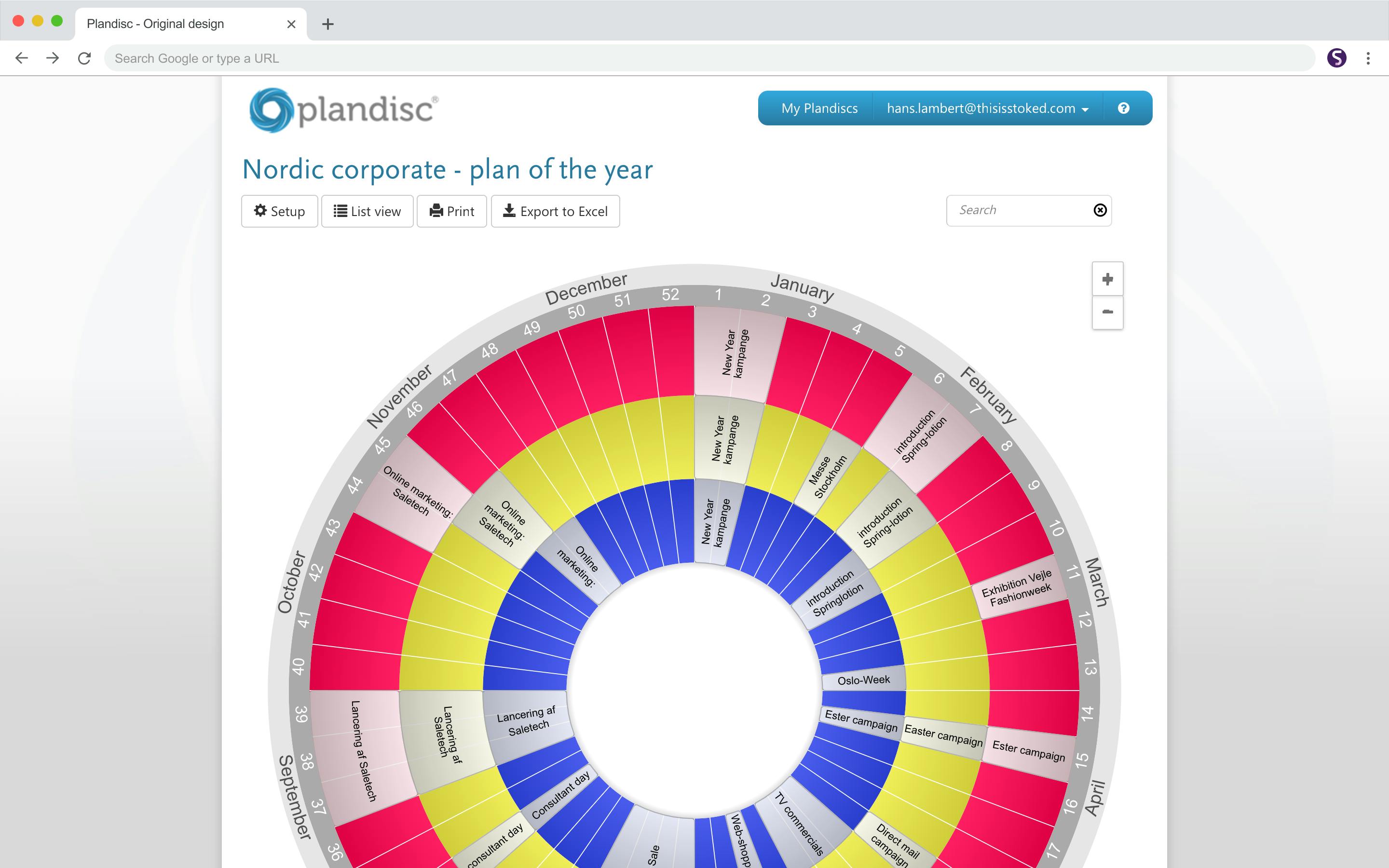
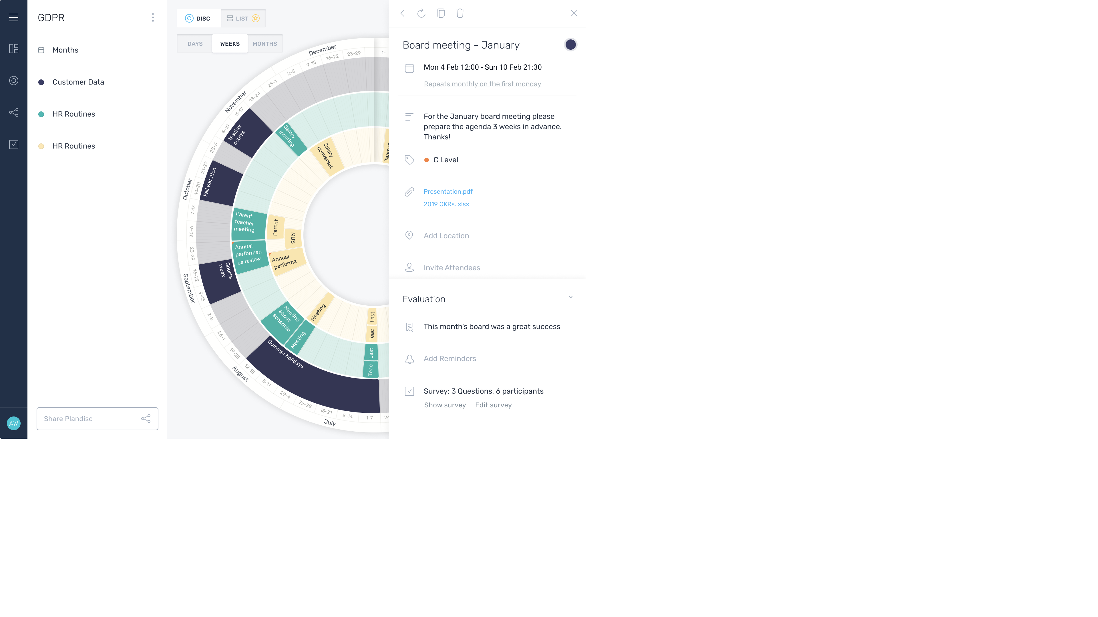
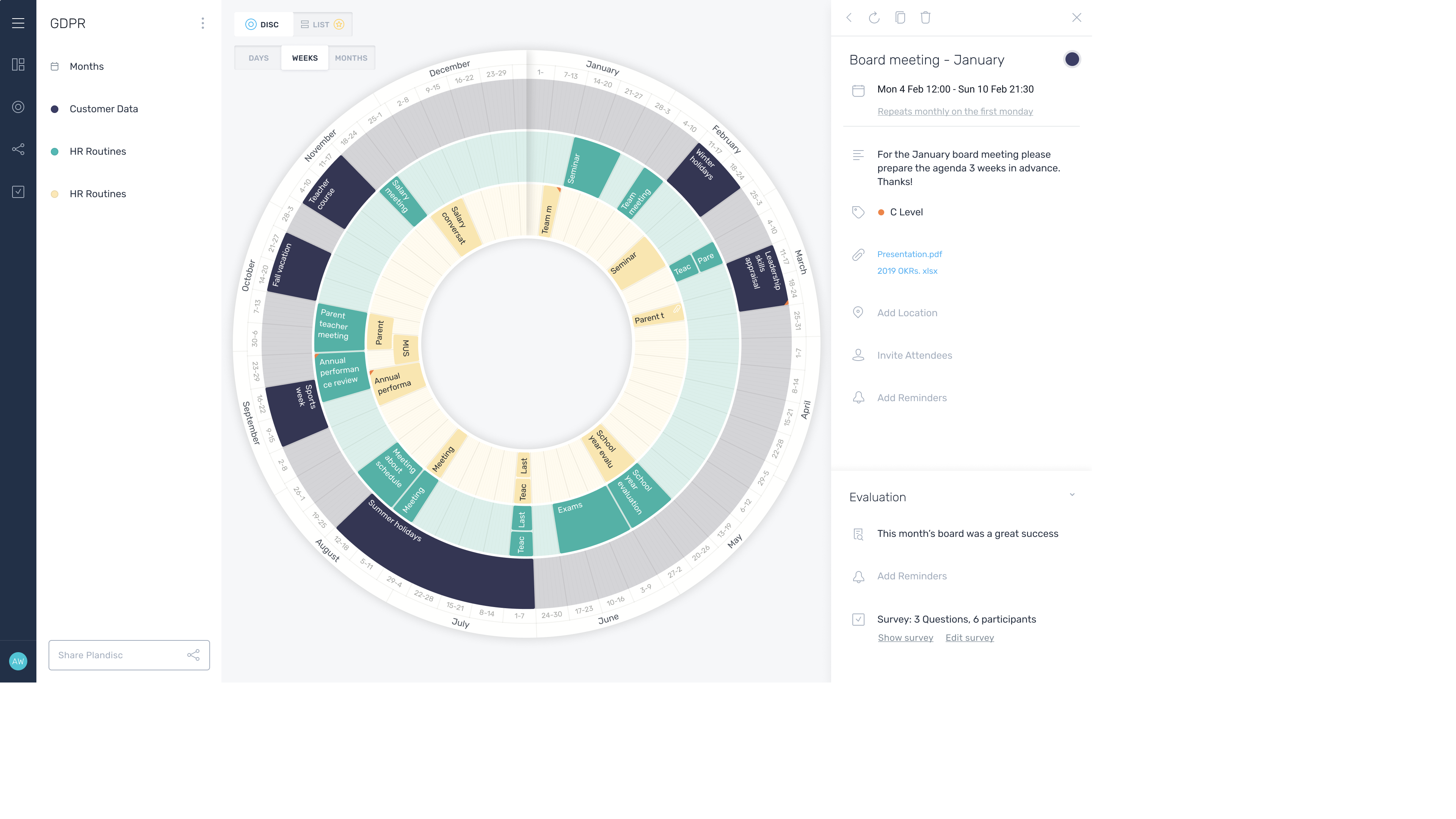
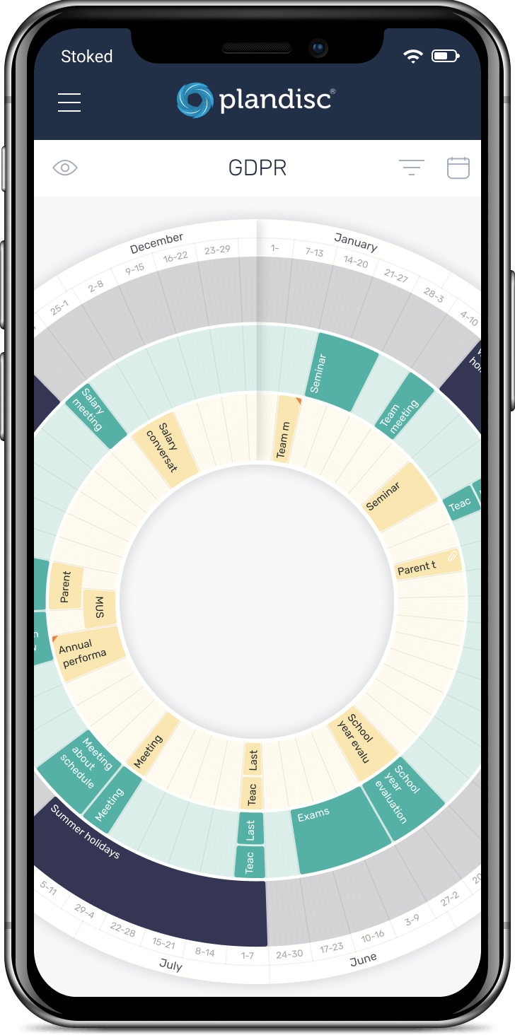
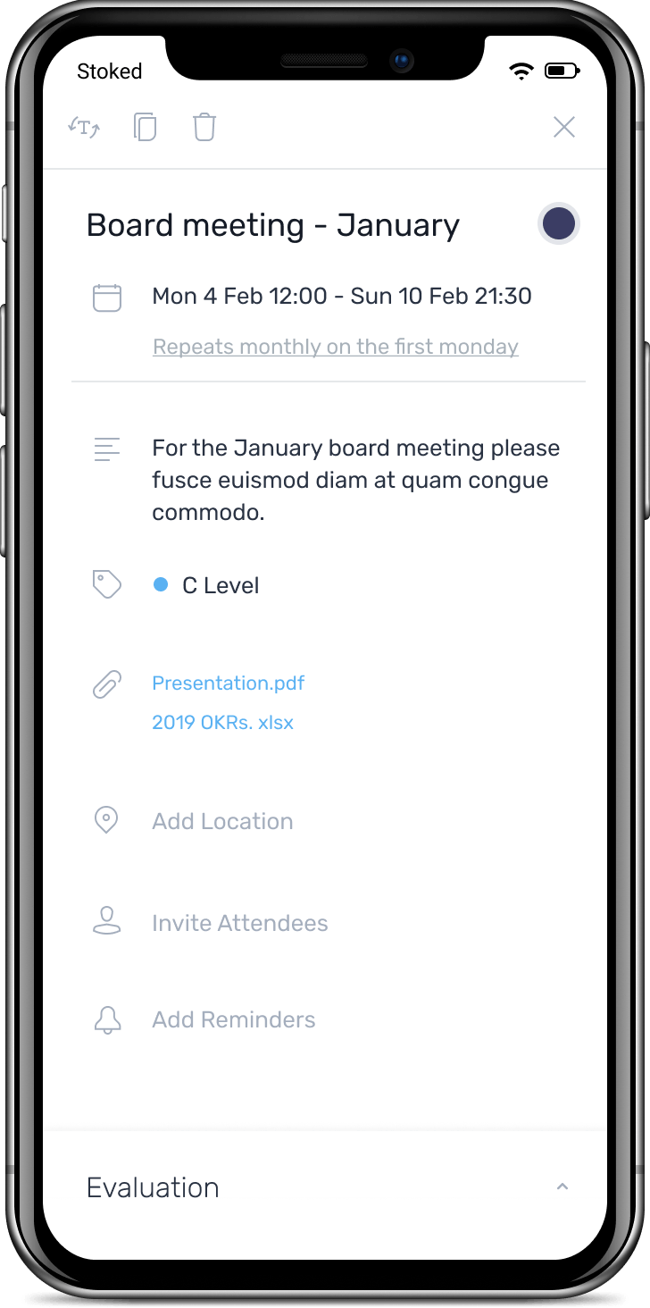
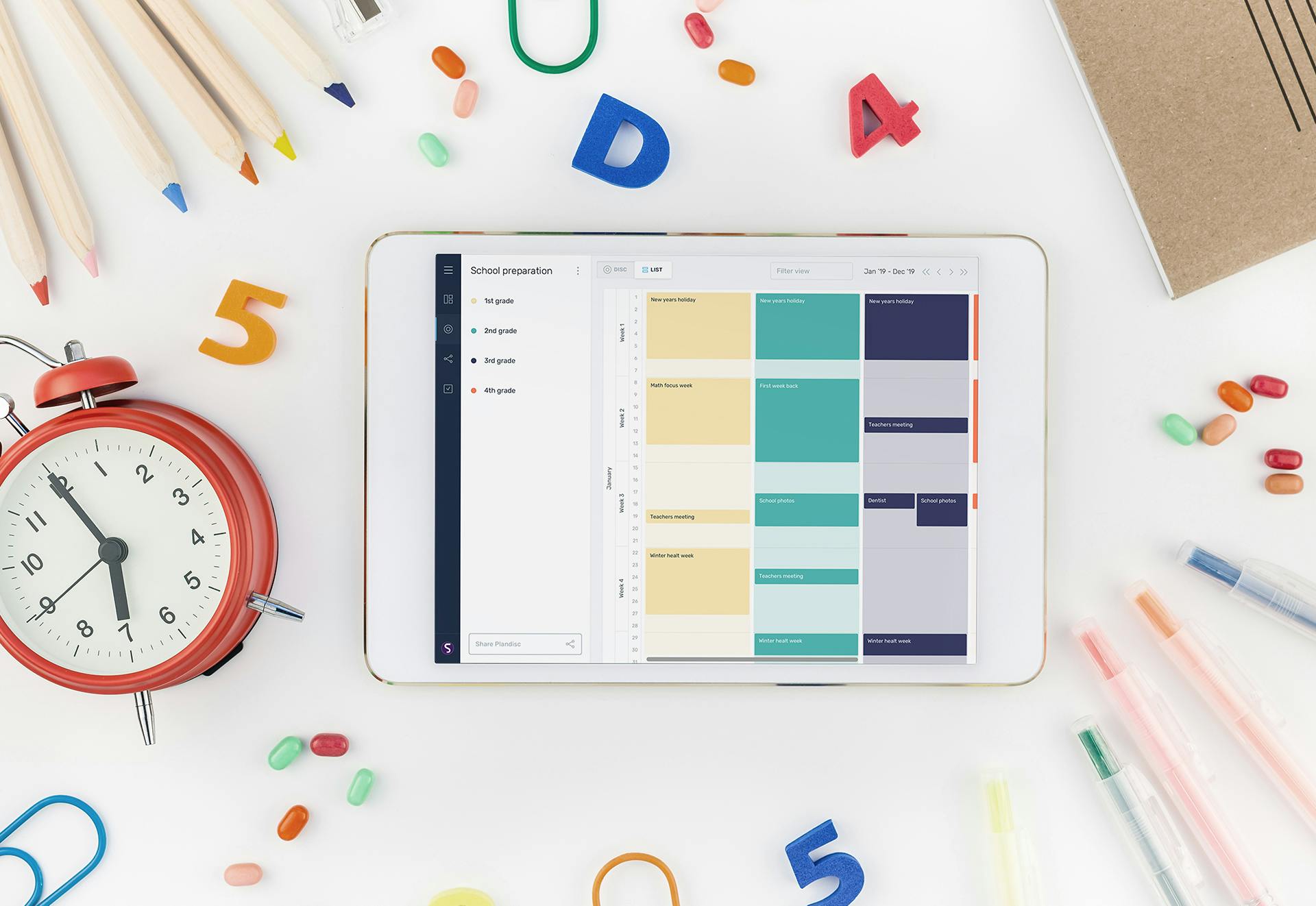
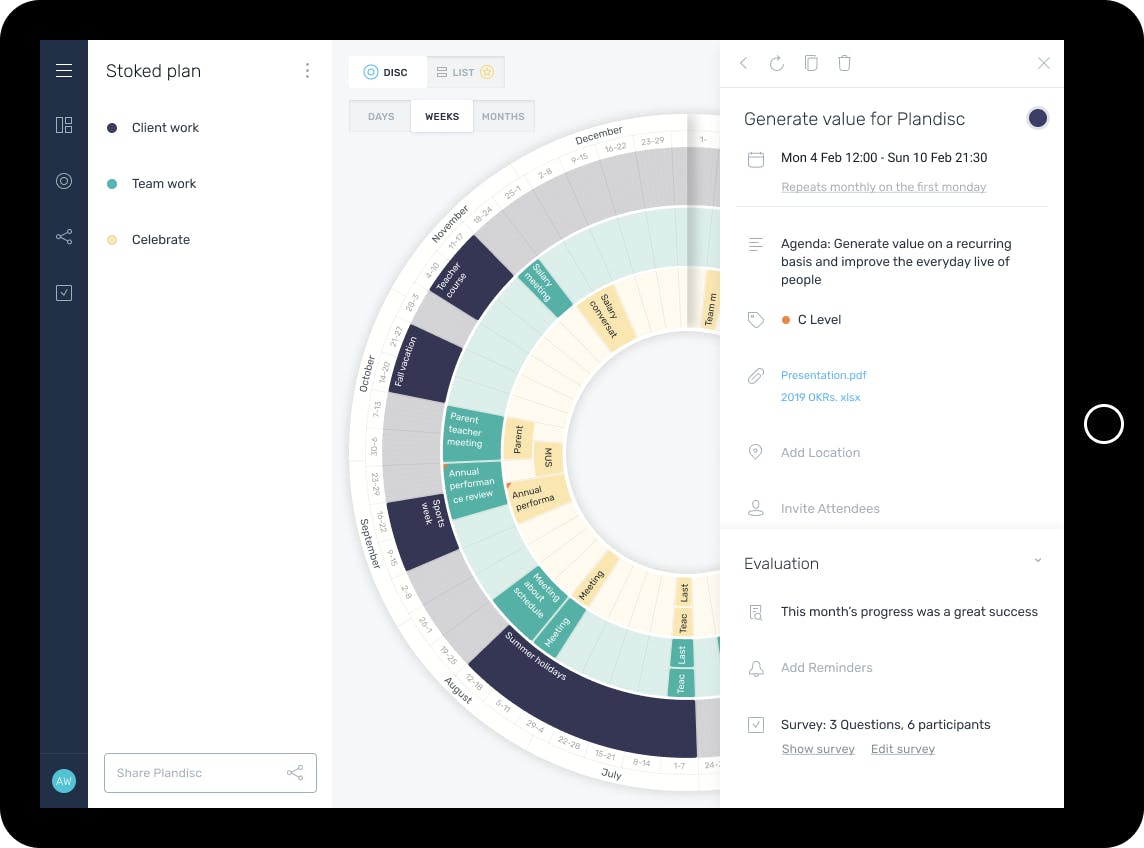
Since launching in 2012, Plandisc’s customer base grew organically over the years, evolving to serve non-governmental organisations, marketing departments and strategic planning activities for customers in eight different countries. Due to their growth, new features were added, which brought further complexities and challenges.

Our job was to improve what their software developers had already created and enhance the user interface so that it can make an impact in the global market.

The main challenges we solved, included:

Image

Fixed browser width

Since they launched in 2012, screen sizes have grown. The tool didn’t support these changes and was providing a sub-optimal experience.

Image

Not mobile optimised

Plandisc’s online tool didn’t support mobile devices, which is required in today’s digital world.

Image

Difficult to navigate 

Features were added over the years, making it hard to navigate around the tool. Promoting new features was difficult and added a lot of noise.

Stoked has really improved the look of the user interface. We now have a product that we can’t wait to launch! You would think that they were two completely different tools, the before and after.
Torben Stigaard, Co-founder and Marketing Manager of Plandisc

About Plandisc

Plandisc was launched in 2012 as a circular planning tool for educational institutions. It enables organisations to plan, visualise and evaluate activities and processes to ensure that all strategic goals and objectives are achieved.

SOLUTION

Using every inch to let the disc shine

The disc is the centerpiece of the application. It’s where the magic happens. To help it shine, we focused the design on giving this as much space as possible. We moved the navigation menu from the top to the left side and the details from being a pop-up to sit on the right side. Making the disc available from all angles.

SOLUTION

Optimising it for every screen

Today we have more screen sizes than ever. It’s a whole spectrum. To help make Plandisc’s online tool accessible on every screen, we redesigned the navigation, disc behavior, accessing details etc. to work on all screen sizes. This includes everything from a 3,5” smartphone to a 27” 4K screen. Both are equally as important and integral in Plandisc’s plans for international growth.
Slide 1
Slide 2
Slide 3
Slide 1

SOLUTION

Picking colours to enrich the UX

Colour picking is a skill most people stop practising when they leave art class in primary school. We provided 5 standard colour schemes with 12 colours in each for people to choose from. Creating better aesthetics helps enhance the user experience.

Try for yourself below!

Color Scheme 1
Color Scheme 2
Color Scheme 3

Nordic woods

Misty rose

Summer party

Image
Image
Image

SOLUTION

Making it mobile-friendly

To optimise the user experience and to make the Plandisc application completely responsive, we packaged it so that it’s optimised on mobile devices, fitting perfectly on iPhones, Androids and any other type of mobile screen. This is a crucial part in making the Plandisc app more accessible on the go and enabling it to broaden its appeal across new markets.
Image

related projects

Like what you see?